By D.J. Sherrets
Stories-first Design Summary Video:
(2 minutes 10 seconds)
Time spent by people watching Instagram Stories — which is temporary sharing with private replies that launched in August 2016 — could someday significantly surpass time spent in the Instagram Feed, which is the permanent stream of photos and videos with comments that launched in October 2010. Although numbers comparing sharing and time spent between Stories and Feed are not available, there’s more to be done.
This feels credible to me for reasons such as Stories is “largely video,” according to the Instagram CEO, and video sharing and watching videos on Instagram are going up over time as a percentage of both time spent and total posts. As of June, video watch-time on Instagram is up 80% year-over-year and the number of videos shared is up 4x. From June 2016 to April 2017, Instagram grew monthly active users by 40%. Before Stories launched, there was a question about a per user Feed photo sharing decrease. A year after Stories launched, people under 25 years spent 32 minutes per day on Instagram on average, and people 25 years and older spent more than 24 minutes per day. That compares to 21 minutes per day on average for all Instagram users in October 2014. As of last week, Instagram Stories has over 300 million daily active users, and that compares to Instagram’s total 500 million daily active users in September.
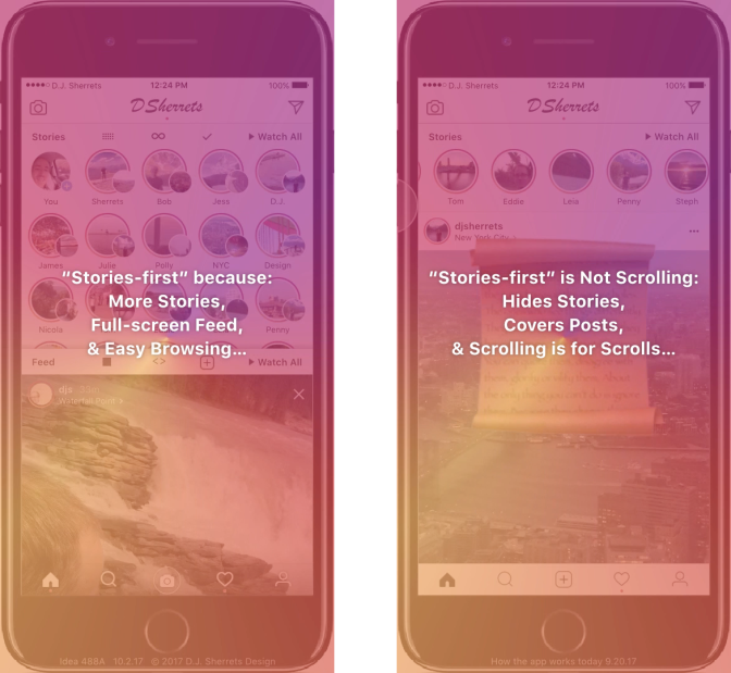
I often visit Instagram only to watch Stories without scrolling through the Feed. I believe Stories-first is happening with how Instagram is used, but Instagram is not yet designed to be Stories-first. At a minimum, the Feed must be improved to the standard of Stories, and Stories must be featured equal to its significant current and expected usage.
How would you imagine Instagram would work if Stories were made first, and Feed didn’t exist? And what if only now Feed were designed and introduced? Viewing Stories full-screen makes sense, which may help explain why it’s “largely video.” However, the scrolling technique used in Feed today obscures that video because the top or bottom is cut-off during scrolls, and scrolling can require more than one gesture — such as swipe-up and then press-to-stop — just to get the next post on the screen. This can cause the user to miss the beginning of the video and also split their focus, while taking more time than necessary. So I felt a need to create a new design.
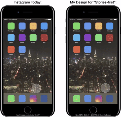
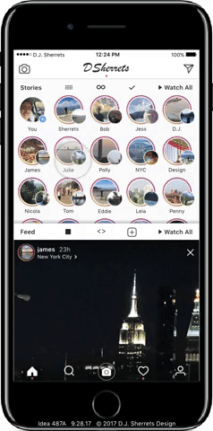
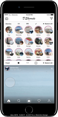
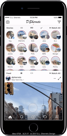
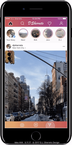
How could Instagram change from Feed-first to Stories-first? Today, Feed scrolling is the primary focus of Instagram’s design. When opening the app, the Feed uses 68.29% of screen-space on iPhone 7 Plus. Meanwhile, Stories is displayed as one horizontal row below the top of the app, assigned 22.55% of screen-space.
Let’s first consider the differences between Instagram Stories and Instagram Feed, and how they could become more similar or different:
Stories core:
A: Delete in 24 hours
B: Replies are private messages
C: Shows who viewed your Story
Feed core:
D: Permanently shared unless deleted
E: Hearts and comments are visible to anyone who can view the post
Stories current design:
A: Small circle profile photo or thumbnail
B: One-tap to next post, or swipe-left to next Story
C: Photo shown for 3 seconds, and video shown once
D: Swipe-up to privately reply, or swipe-down to close
Feed current design:
E: Full-width of video/photo is shown, and conforms to dimensions 1:1 for square, 1.91:1 for landscape, or 4:5 for portrait
F: Name/profile photo appear outside of the video/photo with caption/comments/buttons
G: Scroll-up to view more Feed posts
Imagine combining features across Stories and Feed. What if Stories included comments? Or if Feed was one-tap to advance? Applying learnings from how Stories appears to have made video the focus, a new approach to Feed may increase how many videos are shared, increase the ratio of videos-to-photos shared, and increase how long people want to watch videos on Instagram.
Please let me know your comments/feedback about my design by messaging here. In addition to the video and gif above, I also show how each feature works in my design below.
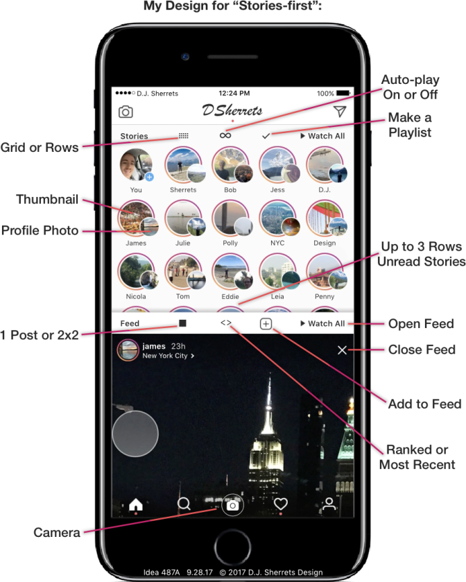
My Design for Stories-first with Feed
Generally, I think this approach could help bring together the user experiences of Feed and Stories, while preserving the distinctions that make each useful.
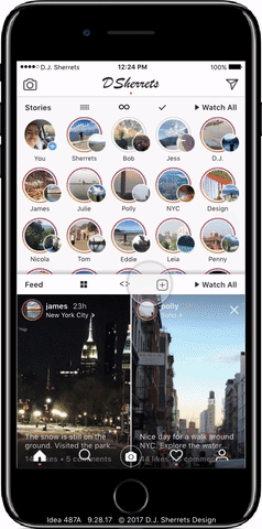
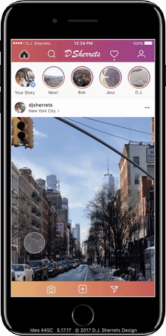
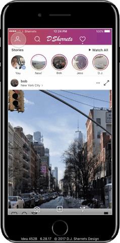
1: Feed and Stories Always One-Swipe Away.
Easily switch between Stories and Feed and vice versa at any time. Imagine if you could open the app, tap on Feed and watch for a while what your friends have been sharing and commenting. Then with just one swipe-down, you can return to the main-screen, which shows up to 3 rows of 5 Stories each. Then you can tap on friends’ Stories you want to watch for a while and send back private replies for some. Then switch back to Feed to check out more updates, and so on.
Below, you start each side at the fifth Feed story, then open the NYC Story, then go to the sixth Feed Story. A bar appears in the middle when finished, and indicates that Stories-first is faster:

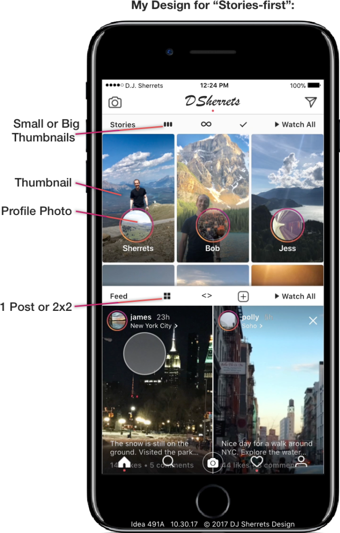
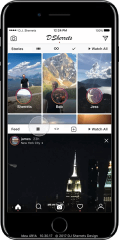
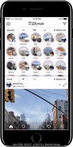
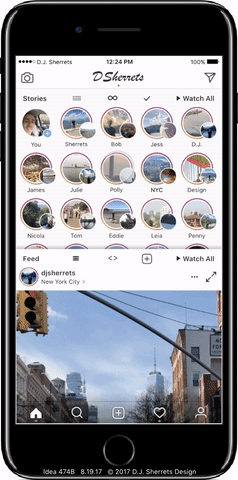
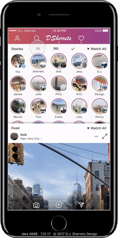
You can switch to view 3 big thumbnails of Stories per row, then view more Stories or go back to the Feed. Today, Instagram shows these larger previews of recent Stories sometimes when you scroll in the Feed, but not at the top of the app.
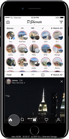
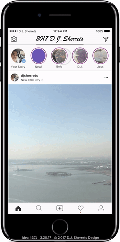
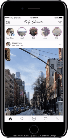
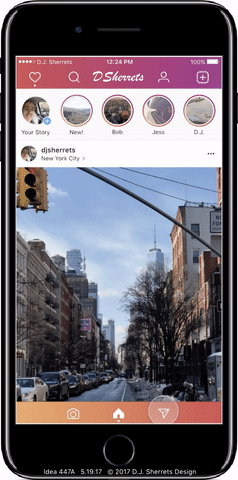
2: Full-screen Feed Posts with One-tap to Next Post.
This is a much faster and easier way to look at content, and it can be done simply with one hand holding the phone. Tap through multiple videos/photos included in an album post. Feed still shows only one post, and focus remains on ranking Feed based on content shared. In contrast, Stories shows all of someone’s posts for that day.
There is no sharing of who viewed each Feed post, so a distinction between Feed and Stories is preserved. Cropping/editing tools of Feed posts would now be included as editing options after making a video/photo in Camera and after selecting from Camera Roll. Note that any dimension video/photo can be posted to the Feed, including using full width/height of available space.
Press on the Feed post to show only the videos/photos, then release to show text and buttons over the videos/photos again. You can also opt to show no animation from right-to-left when a new Feed post is shown, so the focus can remain on the content, without needing to look at the animation.
3: Press-then-swipe-up to Heart.
The gesture replaces double-tap to heart so one-tap is to advance. Note that if you swipe-up and the heart appears, then you can still swipe-down and the heart will not have been sent. A heart is only sent upon release of press after swipe-up.

4: Watch Feed in 2×2 Full-screen and Tap a Feed Post to Expand to Full-size.
Showing a 2×2 of Feed posts lets you view four posts per screen, so you can scan a bunch of posts to decide what to view. Tap on the right-side to go to the next 2×2, or tap on the left-edge to return.
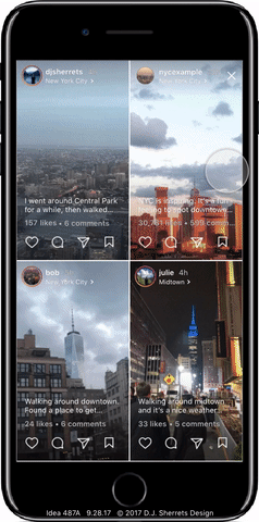
Just tap on a Feed post in a 2×2 to open to full-screen of that post, so there’s a clearer view of the post.
5: Tap Profile then Tap to Open Grid, then One-tap to Next Post.
This is a fast way to check out profile posts with just one-tap, so the design of viewing Profile and viewing Feed are compatible.
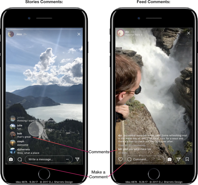
6: Turn on Stories Comments and Require Approval for Comments Before Sharing.
You can choose which posts you may want to share to view responses. Comments in Stories provide a space to share responses among viewers. While knowing the default is the comments are deleted with the Story, this may inspire people to share more comments.
A purpose of the option to review all comments before posting is for the person posting to feel more control over the comments added to their content.
Turn on or off comments by using the camera, then tapping next for the selector.
Tap on comment icon to reply with a comment on a Story, or swipe-up to privately reply. So even with comments on, there remains a default focus on private replies.


7: Choose Each Story Video/Photo to Expire after 6 Hours, 24 Hours, 1 Week, 1 Month, or 6 Months.
You can change the expiration time for each Story you share, in order to control the amount of time the Stories appear. The default time remains 24 hours.
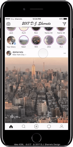
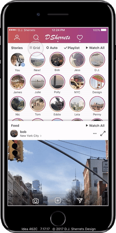
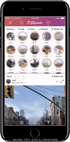
8: Remove Read Stories when Tap Feed, and Feed Moves Up to the First Row if No More Unread Stories.
So the design is flexible even if there are only a few Stories to view. At most there are 4 versions of the layout that could appear: 1 Stories row, 2 Stories rows, 3 Stories rows, and 3 Stories rows with a preview of the fourth Stories row..
Closing after watching 16 Stories:

Closing after watching the last unread Story:
9: Turn-off Auto-play Stories.
Only watch the Stories you tap. Turning-off auto-play can last until you turn it back on. Or, another approach is that turning-off auto-play can last for the current session or 24 hours, then will return to auto-play for the next Story.
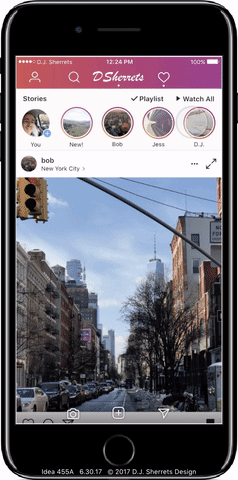
10: Make a Playlist of Stories to Watch Now.
Easily pick which Stories you want to watch.
11: Swipe-right to Open Camera over Home, or Tap Bottom Row Camera to Open — and Swipe-down to Close Camera.
This provides a consistent way to swipe-down to close camera.
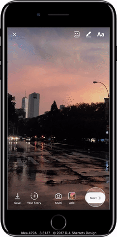
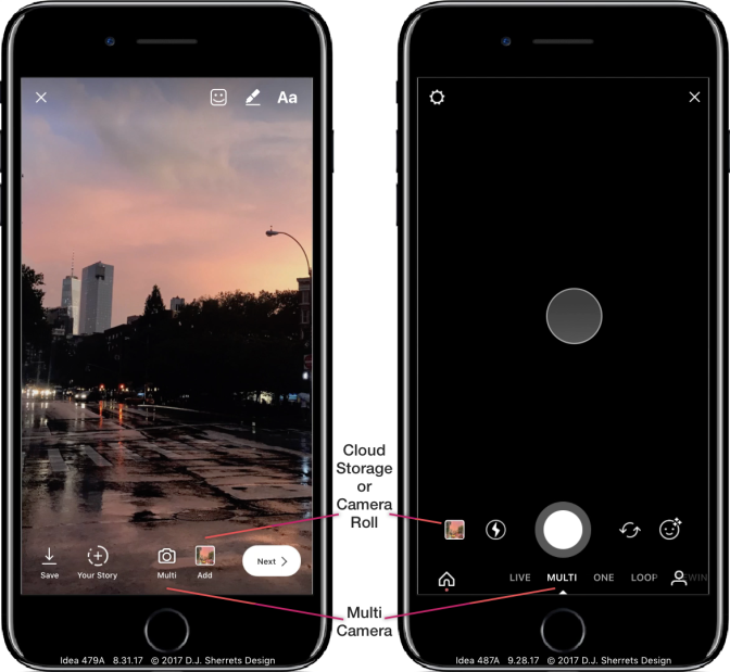
12: Make Multiple Videos/Photos Without Stopping.
Helps bring default function of phone’s camera app into the app for making a bunch of videos/photos when needed in the moment. Use the “Multi” camera option, then tap thumbnail or swipe-up to decide which videos/photos to select. Media would be stored in camera roll or cloud.
Main Design Conclusion:
Plainly, there are many important possibilities to explore. Meanwhile, I believe my approach outlined here could significantly benefit people today. And the purpose is to design and share ideas with people who can inspire change. There could be continued development such as with trying the design with people in the app.
Looking forward, augmented reality could increasingly expand the canvas for information and interaction to everyone, everywhere — but over the coming years, what won’t change about sharing? Sharing the lived experience is a core desire. In some broad definition, it is what makes us alive. And people will want increasing ways to share across dimensions of time, people, place, format, feelings, identity, and more. Really, the story of sharing itself — including what, how, and why — is still being told. As ever.
For higher resolution videos of the ideas above, please visit my Facebook Page.
More Possibilities to Consider
I made design iterations to get to the above versions, including some starting closer to how the app works today, and some not. If there’s only one takeaway from my making these designs, it’s that there are a number of possible directions to go with the product.
Some challenges to making updates may include that people enjoy the scrolling option and/or may not want the change, and may want to keep the double-tap-to-heart option. Further, maybe there is data to support this. Meanwhile, Stories with continued updates and usage growth may become more enjoyed/used both independently and compared to Feed. So below are some approaches that preserve scrolling, while still making Stories more available.
13: Open App to Camera, with Home on Left for Stories and Feed, and with Inbox on Right.
This assumes a lot of sharing of videos/photos, and so the app opens to the camera. And Stories may be more comfortable to scroll through as a vertical list that includes a thumbnail and profile photo.
Feed is not shown by default on the Home screen. So you either tap on “Feed” to open, or scroll far enough past Stories to then open the Feed. Default is showing 2×2 grid of Feed posts. Then tap one to open to full-screen.
Exploring How to View the Feed
I considered whether the Feed should have an option to view that could be different than full-width, such as the 5 columns layout that Stories uses. And I also explored what makes Stories and Feed distinct or connected.
14: Tap to View Feed as Most Recent First, and Optionally Primarily Show Posts by Friends.
Most Recent could also remove accounts that post frequently that you don’t view as much, so focus is on people you know. A repeated request in app reviews or social posts is to view posts by Most Recent. And the default when opening the app would remain showing ranked posts. Most Recent could remove — or at least minimize or visually indicate — posts you have already viewed.
15: Tap to Switch Feed Between 1 Column and 2 Columns — and Tap a Feed Post in 2 Columns Opens to 1 Column, and Swipe-down to Close.
Scrolling in 2 columns may be faster for checking out what is available to view, then to tap for full-size to focus on a post.
Showing More Stories:
I considered how more Stories could be visible. Today, Instagram defaults to showing about 5 Stories when you open the app, then you can swipe horizontally to view more Stories.
16: Swipe-down Stories to View Vertical List.
A vertical list of rows may be convenient for scrolling through a lot of thumbnails of Stories.
17: Swipe-left for Multiple Rows of More Stories, and Watch Stories then Close into Longer List.
This preserves existing design showing about 5 Stories and the Feed, while showing you a lot more Stories, whether you swipe once or after you watch Stories.

18: Swipe-down in Stories to Scroll Vertically, or Watch a Story then Animate to Show More Stories.
Choose to access more Stories in multiple rows so it’s easier to view, or pull-to-refresh on the Feed as works in the app today.
19: Swipe in Stories to Scroll Through Stories, and “Feed” Replaces “Home” Icon — Then Tap Feed Any Time to Open Feed Again.
Provides space to tap to get to Feed quickly, while still easily accessing Home to tap to go to the top of the page or refresh. You can also just scroll through all Stories to scroll into Feed as well.
One-tap to the Next Post:
I explored how you could tap once to get to the next Feed post, including keeping scrolling while making a separate mode for one-tap to the next post, and offering one-tap by default but still allowing for scrolling.
20: Press Expand Icon for One-tap Viewer of Feed.
A tap on the expand icon in upper right is an easy way to get into the one-tap viewer.

21: One-tap on the Left or Right Side of the Bottom Bar to Auto-scroll One Screen Down to Quickly and Easily View Feed Posts.
Provides quick scrolling without having to add a specific button or separate mode from how Feed already looks, so there’s a lot of space to tap.
22: Open App then the First Swipe-up Enters Mode for One-tap or One-swipe-up to Next Post.
One-tap goes fast with no animation, and one-swipe shows the animation. This preserves look and feel of scrolling when swipe-up or swipe-down, while also providing the speed of one-tap to the next post. Press-down causes the post to move down slightly to indicate the direction the post is moving, and then releasing press causes to immediately show the next post with no animation.
23: Long-press on Post to Enter One-tap to the Next Post Mode.
Scrolling in Feed is preserved as the default, but you can choose to enter the fast mode. And fast mode has some motion vertically when press-down for next post, and so preserves mental model of a vertical list of Feed posts, while still showing new posts much faster.

Switching Grid and Rows:
I considered if a Grid showing 5 columns of Stories and showing multiple rows might be showing too much information. Some feedback was that a vertical list of Rows would be preferred. So I explored how you could choose to change between Grid and Rows, and what animation would be shown.
24: Tap for “Grid” to View 5 Columns of Stories, or Tap for “Rows” to Show a Vertical List of Stories — and Switching Shows an Animation.
You can choose which way to view. Grid is easier to scan a bunch of profile photos or thumbnails without scrolling much. And Rows is easier to scroll and focus on the list of profile photos or thumbnails to choose.
25: Keep Showing Person You Last Scrolled to When Switching Between Grid and Rows.
This provides continuity and control when changing between Rows and Grid, and vice versa.
26: Tap Profile Photo in Stories Rows to Open Profile, or Tap Thumbnail to Select for Playlist.
Easily choose to visit the profile of someone who posted a Story and swipe-back from profile to return to Stories, or tap to view a Story or make a Playlist.
Using the Profile
I explored how you could navigate in the profile, including above showing one-tap on a profile post in the 3 column grid, then one-tap to advance through the profile posts, and swipe-down to close. Currently on Instagram, a tap on a post in the profile grid opens that one post, then you swipe-right to go back to choose from more posts in the grid.
27: In the Profile, Tap the Expand Icon Next to a Post in the Scrolling One-column View then One-tap to the Next Post.
Then swipe-down to close back. This is a faster way to view the posts in a profile, with the assumption that preserving default of scrolling is necessary. Note that after using one-tap to the next post, then you can swipe-down to return to scrolling one-column. And then scroll-back to the top of the profile if you want.
Making a Playlist
I explored how you could make a playlist whether in Grid or in Rows.
28: Tap “Playlist” Expands from One Horizontal Row of Stories to Show All Available Stories, then Tap Profile Circles to Select, then Tap “Watch #” to Play.
This is easy to select Stories to watch, while assuming necessary to preserve app currently showing one horizontal row of Stories. The Feed post animates down to make space for vertically scrolling through Stories.
29: Tap the Story Thumbnails on the Left Side to Make a Playlist, then Tap “Watch #” to Play.
The gradient outline around “Watch #” is consistent with the gradient around each Story, and indicates a state change from “Watch All” to “Watch #” for a Playlist.

Featuring Home, Camera, and Inbox Buttons on the Bottom
I explored how the bottom row of buttons could focus on Home, Camera, and Inbox as the primary features, and the top bar could show Profile and Search buttons.
30: Swipe from Home to Inbox Animates the Change of Buttons in the Upper Right.
This provides space to adjust some buttons as needed while keeping some buttons, as has been done before in other apps. Camera and Inbox buttons are placed on the bottom for ease of access with one-tap.
31: Swipe to Inbox Animates Change of “Add to Feed” Icon to “Feed” Icon.
This way the space for the Feed icon on Inbox can instead be used for the “Add to Feed” button when switching back.
Send a direct message to the author:
