By DJ Sherrets
Please visit https://djsherrets.com/2017/11/11/imagining-instagram-stories-first/ for the full article of design ideas about Instagram.
===
Message the author with feedback or questions:


More Possibilities to Consider
I made design iterations to get to the above versions, including some starting closer to how the app works today, and some not. If there’s only one takeaway from my making these designs, it’s that there are a number of possible directions to go with the product.
Some challenges to making updates may include that people enjoy the scrolling option and/or may not want the change, and may want to keep the double-tap-to-heart option. Further, maybe there is data to support this. Meanwhile, Stories with continued updates and usage growth may become more enjoyed/used both independently and compared to Feed. So below are some approaches that preserve scrolling, while still making Stories more available.
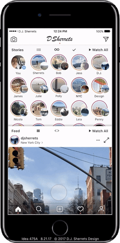
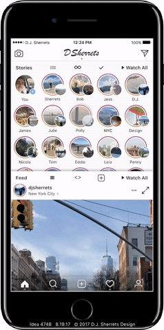
m: Open App to Camera, with Home on Left for Stories and Feed, and with Inbox on Right.
This assumes a lot of sharing of videos/photos, and so the app opens to the camera. And Stories may be more comfortable to scroll through as a vertical list that includes a thumbnail and profile photo.
Feed is not shown by default on the Home screen. So you either tap on “Feed” to open, or scroll far enough past Stories to then open the Feed. Default is showing 2×2 grid of Feed posts. Then tap one to open to full-screen.
Exploring How to View the Feed
I considered whether the Feed should have an option to view that could be different than full-width, such as the 5 columns layout that Stories uses. And I also explored what makes Stories and Feed distinct or connected.
n: Tap to View Feed as Most Recent First, and Optionally Primarily Show Posts by Friends.
Most Recent could also remove accounts that post frequently that you don’t view as much, so focus is on people you know. A repeated request in app reviews or social posts is to view posts by Most Recent. And the default when opening the app would remain showing ranked posts. Most Recent could remove — or at least minimize or visually indicate — posts you have already viewed.
o: Tap to Switch Feed Between 1 Column and 2 Columns — and Tap a Feed Post in 2 Columns Opens to 1 Column, and Swipe-down to Close.
Scrolling in 2 columns may be faster for checking out what is available to view, then to tap for full-size to focus on a post.
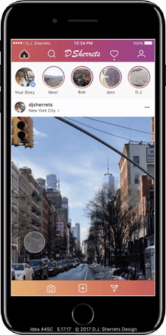
Showing More Stories:
I considered how more Stories could be visible. Today, Instagram defaults to showing about 5 Stories when you open the app, then you can swipe horizontally to view more Stories.
p: Swipe-down Stories to View Vertical List.
A vertical list of rows may be convenient for scrolling through a lot of thumbnails of Stories.
q: Swipe-left for Multiple Rows of More Stories, and Watch Stories then Close into Longer List.
This preserves existing design showing about 5 Stories and the Feed, while showing you a lot more Stories, whether you swipe once or after you watch Stories.

r: Swipe-down in Stories to Scroll Vertically, or Watch a Story then Animate to Show More Stories.
Choose to access more Stories in multiple rows so it’s easier to view, or pull-to-refresh on the Feed as works in the app today.
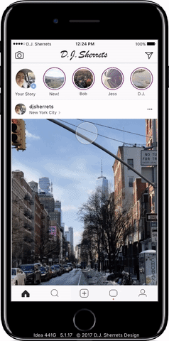
s: Swipe in Stories to Scroll Through Stories, and “Feed” Replaces “Home” Icon — Then Tap Feed Any Time to Open Feed Again.
Provides space to tap to get to Feed quickly, while still easily accessing Home to tap to go to the top of the page or refresh. You can also just scroll through all Stories to scroll into Feed as well.
One-tap to the Next Post:
I explored how you could tap once to get to the next Feed post, including keeping scrolling while making a separate mode for one-tap to the next post, and offering one-tap by default but still allowing for scrolling.
t: Press Expand Icon for One-tap Viewer of Feed.
A tap on the expand icon in upper right is an easy way to get into the one-tap viewer.

u: One-tap on the Left or Right Side of the Bottom Bar to Auto-scroll One Screen Down to Quickly and Easily View Feed Posts.
Provides quick scrolling without having to add a specific button or separate mode from how Feed already looks, so there’s a lot of space to tap.
v: Open App then the First Swipe-up Enters Mode for One-tap or One-swipe-up to Next Post.
One-tap goes fast with no animation, and one-swipe shows the animation. This preserves look and feel of scrolling when swipe-up or swipe-down, while also providing the speed of one-tap to the next post. Press-down causes the post to move down slightly to indicate the direction the post is moving, and then releasing press causes to immediately show the next post with no animation.
w: Long-press on Post to Enter One-tap to the Next Post Mode.
Scrolling in Feed is preserved as the default, but you can choose to enter the fast mode. And fast mode has some motion vertically when press-down for next post, and so preserves mental model of a vertical list of Feed posts, while still showing new posts much faster.

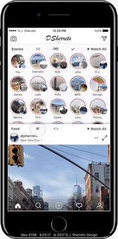
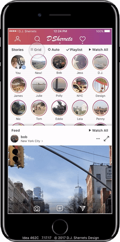
Switching Grid and Rows:
I considered if a Grid showing 5 columns of Stories and showing multiple rows might be showing too much information. Some feedback was that a vertical list of Rows would be preferred. So I explored how you could choose to change between Grid and Rows, and what animation would be shown.
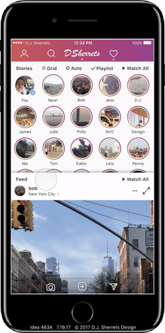
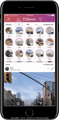
x: Tap for “Grid” to View 5 Columns of Stories, or Tap for “Rows” to Show a Vertical List of Stories — and Switching Shows an Animation.
You can choose which way to view. Grid is easier to scan a bunch of profile photos or thumbnails without scrolling much. And Rows is easier to scroll and focus on the list of profile photos or thumbnails to choose.
y: Keep Showing Person You Last Scrolled to When Switching Between Grid and Rows.
This provides continuity and control when changing between Rows and Grid, and vice versa.
z: Tap Profile Photo in Stories Rows to Open Profile, or Tap Thumbnail to Select for Playlist.
Easily choose to visit the profile of someone who posted a Story and swipe-back from profile to return to Stories, or tap to view a Story or make a Playlist.
Using the Profile
I explored how you could navigate in the profile, including above showing one-tap on a profile post in the 3 column grid, then one-tap to advance through the profile posts, and swipe-down to close. Currently on Instagram, a tap on a post in the profile grid opens that one post, then you swipe-right to go back to choose from more posts in the grid.
a2: In the Profile, Tap the Expand Icon Next to a Post in the Scrolling One-column View then One-tap to the Next Post.
Then swipe-down to close back. This is a faster way to view the posts in a profile, with the assumption that preserving default of scrolling is necessary. Note that after using one-tap to the next post, then you can swipe-down to return to scrolling one-column. And then scroll-back to the top of the profile if you want.
Making a Playlist
I explored how you could make a playlist whether in Grid or in Rows.
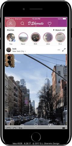
b2: Tap “Playlist” Expands from One Horizontal Row of Stories to Show All Available Stories, then Tap Profile Circles to Select, then Tap “Watch #” to Play.
This is easy to select Stories to watch, while assuming necessary to preserve app currently showing one horizontal row of Stories. The Feed post animates down to make space for vertically scrolling through Stories.
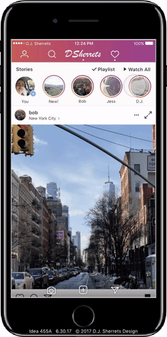
c2: Tap the Story Thumbnails on the Left Side to Make a Playlist, then Tap “Watch #” to Play.
The gradient outline around “Watch #” is consistent with the gradient around each Story, and indicates a state change from “Watch All” to “Watch #” for a Playlist.

Featuring Home, Camera, and Inbox Buttons on the Bottom
I explored how the bottom row of buttons could focus on Home, Camera, and Inbox as the primary features, and the top bar could show Profile and Search buttons.
d2: Swipe from Home to Inbox Animates the Change of Buttons in the Upper Right.
This provides space to adjust some buttons as needed while keeping some buttons, as has been done before in other apps. Camera and Inbox buttons are placed on the bottom for ease of access with one-tap.
e2: Swipe to Inbox Animates Change of “Add to Feed” Icon to “Feed” Icon.
This way the space for the Feed icon on Inbox can instead be used for the “Add to Feed” button when switching back.
Send a direct message to the author:
